
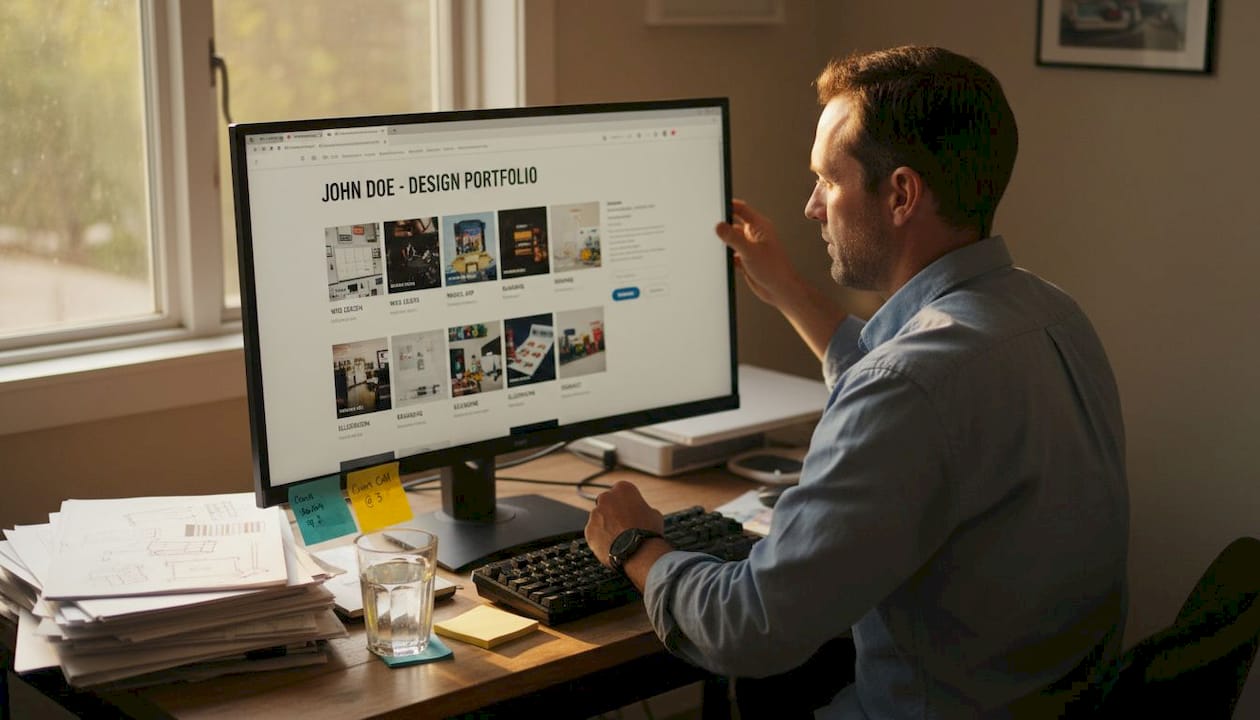
Your portfolio might be costing you opportunities before anyone reads a single word. Recruiters and clients form opinions in seconds, and a cluttered, slow, or outdated design can signal carelessness before your skills ever get a chance to speak. According to a UX portfolio audit, your design must be clean, accessible, mobile-responsive, and easy to navigate to reflect your professional standards. In this article, you'll learn why design is a make-or-break factor, what elements actually move the needle, and how to remove the hidden barriers that stop reviewers from engaging with your work.
Table of Contents
- Why first impressions in portfolio design matter
- Key elements of effective portfolio design
- Reducing barriers: How design impacts portfolio access
- Design for credibility: Standing out in a crowded market
- What most guides miss: Portfolio design is about removing friction
- Next steps: Build a frictionless portfolio with the right tools
- Frequently asked questions
Key Takeaways
| Point | Details |
|---|---|
| Design drives first impressions | Your portfolio's layout and readability can make or break job and client opportunities in under 30 seconds. |
| Eliminate friction | Remove complex navigation and slow-loading elements to ensure your portfolio actually gets reviewed. |
| Credibility through design | Simple, accessible, and professional portfolios instantly boost trust with hiring managers and clients. |
| Focus on accessibility | Readable typography, mobile responsiveness, and clear structure are essential for all audiences. |
Why first impressions in portfolio design matter
Let's start by understanding the power of first impressions in portfolio review. You have about 29 seconds. That's the window a recruiter or client gives your portfolio before deciding whether to keep reading or move on. A cluttered layout, inconsistent fonts, or a wall of text signals one thing fast: this person doesn't pay attention to detail.
Design is a proxy for professionalism. When someone lands on your portfolio, they're not just evaluating your projects. They're reading your ability to communicate, organize, and present information clearly. A polished layout says you take your work seriously. A messy one says the opposite, even if your actual skills are excellent.
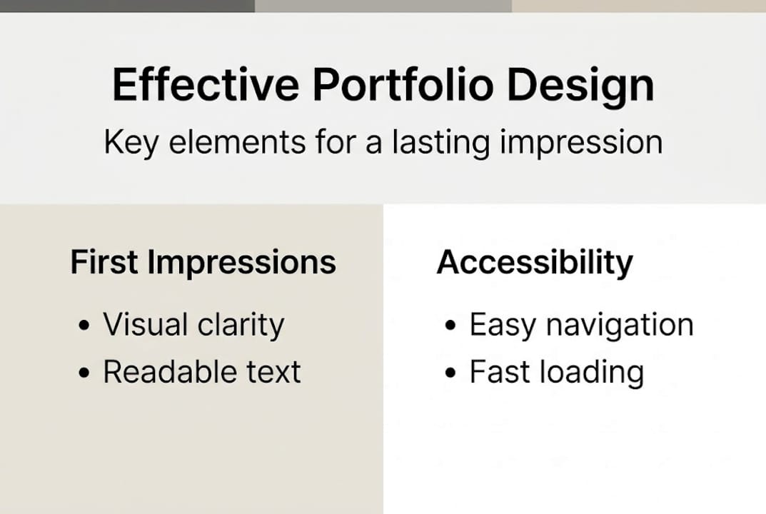
Modern portfolio design best practices aren't complicated, but they are specific. Clean, accessible, mobile-responsive design with clear navigation, generous whitespace, and readable typography are the baseline. These aren't aesthetic preferences. They're functional requirements that determine whether someone stays or leaves.
Here's what strong portfolio design communicates at a glance:
- Clear hierarchy: Visitors know exactly where to look first
- Consistent visual identity: Fonts, colors, and spacing feel intentional
- Fast loading: No one waits more than a few seconds for a page to load
- Mobile compatibility: Reviewers often check portfolios on their phones
- Accessible navigation: Finding your work should take one or two clicks
"Your portfolio is not just a gallery of work. It's a live demonstration of how you think and communicate."
Different design styles serve different audiences. A Typewriter Portfolio feels editorial and creative, ideal for writers or journalists. A Brutalist Portfolio style makes a bold statement for designers who want to stand out. A softer Watercolor Portfolio template works well for illustrators or brand designers. The style you choose sends a message before your work does. Make sure that message is intentional.
Key elements of effective portfolio design
Now that first impressions are clear, let's dig into what makes portfolio design truly effective. It's not just about looking good. It's about making it effortless for someone to understand who you are and what you do.
Readability is the foundation. Body text at 16px with a 4.5:1 contrast ratio is the standard for accessible design. That might sound technical, but it simply means your text should be large enough to read comfortably and dark enough to stand out against the background. Small gray text on a white background is a common mistake that makes portfolios exhausting to read.
Here's a quick comparison of good versus poor design choices:
| Design element | Good practice | Poor practice |
|---|---|---|
| Font size | 16px or larger for body text | 12px or smaller |
| Color contrast | 4.5:1 ratio minimum | Low contrast, hard to read |
| Navigation | Clear labels, 1-2 clicks to content | Buried menus, unclear labels |
| Whitespace | Generous spacing between sections | Crowded, dense layouts |
| Mobile layout | Fully responsive, easy to scroll | Broken on small screens |
| Loading speed | Under 3 seconds | Slow, heavy media files |
Navigation matters more than most people realize. A recruiter spending 29 seconds on your portfolio won't hunt for your work. The Window Portfolio navigation style, for example, uses clear section labels and intuitive flow to keep visitors engaged. When navigation is confusing, bounce rates go up and your chances go down.
Here are the top design priorities to get right:
- Typography: Choose one or two readable fonts and stick with them throughout
- Color palette: Limit yourself to three to four colors maximum
- Whitespace: Give your content room to breathe between sections
- Image quality: Use high-resolution visuals that load quickly
- Accessibility: Check contrast ratios and text sizes before publishing
The Chalkboard Portfolio and Particles Portfolio both demonstrate how strong visual contrast and clean spacing can make a portfolio feel both creative and professional without sacrificing readability.
Pro Tip: Use a free contrast checker tool like WebAIM's Contrast Checker to verify your text and background colors meet accessibility standards before sharing your portfolio with anyone.
Reducing barriers: How design impacts portfolio access
A slick design means little if barriers stop reviewers. Here's why reducing friction is crucial. Friction is anything that slows down or blocks a reviewer from seeing your work. It's one of the most overlooked reasons portfolios fail, and it has nothing to do with how talented you are.
Think about the last time you clicked a link that took forever to load, or asked you to log in before showing you anything. You probably left. Hiring managers and clients do the same thing. Friction cuts responses by 37% when portfolio links aren't optimized. That's a massive drop in opportunity caused by a technical problem, not a skills problem.
Here's a breakdown of the most common access barriers and how to fix them:
| Access barrier | Impact | Solution |
|---|---|---|
| Slow page load | Reviewer leaves before content appears | Compress images, use fast hosting |
| Login or sign-up wall | Blocks immediate access | Use public, shareable links |
| Broken links | Creates distrust instantly | Test all links before sharing |
| No mobile version | Excludes mobile reviewers | Use responsive templates |
| Poor file formats | Hard to open or view | Use web-based or PDF formats |
The fix isn't complicated. Use shareable portfolio links that open instantly without requiring accounts or downloads. Embed a short summary of your best work directly in your application so reviewers get value before they even click through.
Common portfolio access pitfalls to avoid:
- Linking to a portfolio that requires a password
- Using large uncompressed images that slow load times
- Sharing Google Drive or Dropbox folders instead of a dedicated portfolio page
- Forgetting to test your link on mobile before sending it
- Using platforms that are blocked by corporate firewalls
The Map Portfolio structure takes a smart approach by organizing content in a way that guides visitors directly to the most important work without unnecessary clicks. Pair that with a portfolio chatbot feature and you give reviewers an interactive way to explore your work on their own terms.
Design for credibility: Standing out in a crowded market
Beyond getting noticed, a great design sets you apart as reliable and professional. Credibility isn't just about having impressive projects. It's about presenting them in a way that makes people trust you before they've even read the details.
Consistency is the fastest way to build visual credibility. When your fonts, colors, and spacing are uniform across every page, it signals that you're detail-oriented and intentional. Inconsistency, even small things like different font sizes on different pages, creates a subtle sense of disorder that undermines trust.
Social proof amplifies credibility. A well-placed testimonial from a past client or professor, formatted cleanly and positioned near your featured work, can shift a reviewer's perception significantly. Case studies that follow a clear structure (problem, approach, result) show you can think strategically, not just execute tasks.
Three quick design tweaks that build instant credibility:
- Add a professional headshot: A clear, well-lit photo makes your portfolio feel personal and trustworthy
- Include a one-line value statement: Tell visitors exactly who you help and how, right at the top
- Organize work by outcome: Lead with the result, not the process
Some guides debate whether to include portfolio links at all in job applications. Contrasting views exist on this, with some experts advising against links due to friction and others insisting on prominent placement. The answer depends on optimization. A well-designed, fast-loading portfolio link is an asset. A slow or broken one is a liability.
Pro Tip: Think of your portfolio as a form of personal branding photography. Every visual element tells a story about who you are. Make sure it's the story you want to tell.
For freelancer portfolios especially, credibility design is everything. Clients are making a financial decision. They need to feel confident before they reach out. A clean, consistent, well-structured portfolio removes doubt and makes that decision easier.
What most guides miss: Portfolio design is about removing friction
Most portfolio advice focuses on aesthetics. Use this color palette. Pick these fonts. Add animations. But here's the uncomfortable truth: beautiful design that's hard to navigate is worse than plain design that's easy to use.
The real job of portfolio design is to remove every possible obstacle between a reviewer and your best work. That means fast load times, clear navigation, accessible text, and links that actually work. The Map Portfolio approach gets this right by prioritizing user journey over visual flair.
We've seen portfolios with stunning visuals get ignored because they loaded slowly or required too many clicks to find the actual work. And we've seen simple, clean portfolios land interviews because they were effortless to review. Speed and clarity beat beauty every time when someone is scanning dozens of candidates in an afternoon. Design for the reviewer's experience, not your own aesthetic preferences. That shift in thinking changes everything.
Next steps: Build a frictionless portfolio with the right tools
Ready to create your standout portfolio? Here's how Prezumi can help. Everything covered in this article, from clean layouts and mobile responsiveness to ATS-ready structure and shareable links, is built into Prezumi's portfolio tools from the start.
With the Matrix Portfolio Template, you get a design that's structured for clarity and built to impress. The AI Portfolio Editor helps you refine your content and layout without needing design experience. And with a full library of AI Portfolio Templates, you can find the right style for your field and have a recruiter-ready portfolio live in minutes. No design skills required. No friction for your reviewers. Just your work, presented at its best.
Frequently asked questions
What is the most important aspect of portfolio design?
Accessibility and simplicity matter most. Your portfolio must be easy to view and understand on any device, because clean, mobile-responsive design is what keeps recruiters and clients engaged long enough to evaluate your work.
Does ATS (Applicant Tracking System) compatibility matter for portfolios?
Yes, ATS-friendly portfolios are easier for systems and humans to scan, which increases your chances of getting called for an interview. Clear structure, readable text, and relevant keywords all contribute to better ATS performance.
How can I reduce friction for reviewers accessing my portfolio?
Keep navigation simple, avoid slow-loading pages, and always share direct, optimized links. Friction reduces responses by 37%, so embedding a summary in your application alongside the link is a smart way to give reviewers immediate value.
Can a portfolio design really influence hiring decisions?
Absolutely. Recruiters form opinions in seconds, and a weak design undermines your credibility before your skills get a fair look. Clean, accessible portfolio design is what signals professionalism and attention to detail from the very first glance.