
Most people assume that a portfolio packed with stunning visuals is a winning portfolio. That logic makes sense on the surface, but recruiters and clients tell a different story. Recruiters prioritize visuals first but quickly reject portfolios that show only polished outcomes without any evidence of the thinking behind them. The real differentiator is not how beautiful your portfolio looks. It is how clearly your visuals communicate your process, your decisions, and your results. This guide walks you through what types of visuals actually matter, how to balance them with text, and how to make every image earn its place.
Table of Contents
- Why visuals matter: Hooking attention and building credibility
- Types of visuals that elevate your portfolio
- How much is enough? Achieving visual-text balance
- Quality over quantity: Making every visual count
- Adapting your portfolio for the AI era
- What the experts miss: Balancing storytelling and strategy
- Level up your portfolio with tailor-made templates
- Frequently asked questions
Key Takeaways
| Point | Details |
|---|---|
| Balance visuals and text | Aim for 20-40 percent visuals with clear process context for credibility. |
| Prioritize quality | High-resolution, realistic visuals build trust more than quantity alone. |
| Show your process | Recruiters want to see how you think, not just the final product. |
| Adapt for the AI era | Highlight your unique judgment and decision-making in visuals to stand out today. |
Why visuals matter: Hooking attention and building credibility
Visuals do the heavy lifting in those first few seconds. Before a recruiter reads a single word, they have already formed an impression based on what they see. That impression is either "I want to keep reading" or "next." This is why visual presentation is not optional. It is the price of entry.
But here is where most portfolios go wrong. They treat visuals as decoration rather than evidence. A beautifully rendered final mockup tells a viewer what you produced. A sketch, a wireframe, or a journey map tells them how you think. Process visuals build credibility in a way that polished finals simply cannot. Recruiters know the difference, and they look for it.
"A portfolio without process visuals is like a resume without work experience. The result might look great, but there is nothing to trust it with."
The optimal approach blends two things: visual hooks that grab attention, and process visuals that validate your skills. Think of it as a one-two punch. The hook gets them in the door. The process keeps them reading.
Here is what to keep in mind when building that blend:
- Lead with your strongest visual to create an immediate positive impression
- Follow immediately with process artifacts like sketches, wireframes, or research maps
- Include at least one data visualization or impact metric per case study
- Caption every visual so the reader understands what they are looking at and why it matters
- Limit yourself to 3-5 case studies to avoid overwhelming the viewer with volume
Visual overload is a real risk. A portfolio that throws 40 images at a viewer without context reads as chaotic, not creative. Restraint signals confidence. Choosing your best work and presenting it with clarity shows that you understand what matters, which is exactly what employers and clients want to see. Explore how templates like the Particles template or the Window template are designed to give your visuals room to breathe without cluttering the page.
Strong business portfolio visuals also signal professionalism before a word is read, reinforcing the idea that first impressions are built visually, not verbally.
Types of visuals that elevate your portfolio
Not all visuals are created equal. Knowing which types to include, and when, is what separates a memorable portfolio from a forgettable one.
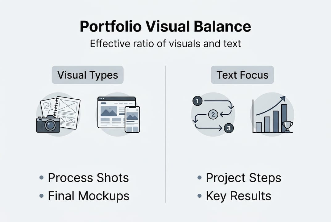
Effective portfolio visuals fall into four main categories: process artifacts, research visualizations, impact metrics, and final mockups. Each serves a distinct purpose, and the strongest portfolios use all four.
| Visual type | Purpose | When to use |
|---|---|---|
| Process artifacts | Show your thinking and iteration | Early in each case study |
| Research visualizations | Prove you understand the user or problem | After defining the challenge |
| Impact metrics | Demonstrate real-world results | At the end of each project |
| Final mockups | Showcase execution quality | As the visual payoff |
A portfolio that shows only final mockups is like a movie with no plot. It might look good, but there is nothing to connect with. Process artifacts, on the other hand, make your thinking visible and give the viewer something to follow.
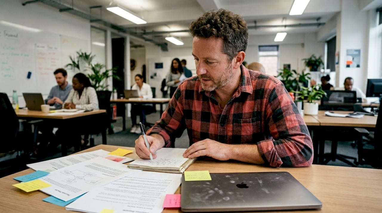
Pro Tip: If you are a student or early-career professional without much client work, spec projects and personal redesigns with strong process documentation are just as effective. Recruiters care about the quality of your thinking, not the size of your client list.
Here is a step-by-step approach for integrating these visuals into a case study:
- Open with the problem statement paired with a research visualization or user journey map
- Show early sketches or wireframes to demonstrate your ideation process
- Include an iteration snapshot that shows how your design evolved based on feedback
- Present impact metrics using a simple chart or annotated before-and-after comparison
- Close with high-quality final mockups that show the finished product in realistic context
This structure gives your portfolio a narrative arc. Each visual advances the story rather than just filling space. Templates like the Infographic template and the Map template are built specifically to support this kind of structured visual storytelling.
How much is enough? Achieving visual-text balance
One of the most common questions is: how many visuals should I actually include? The answer is more specific than most guides admit.
Aim for 20-40% visual content relative to text, distributed across all stages of your case study, not just clustered at the end. This ratio keeps the portfolio readable while giving visuals enough presence to do their job.
| Project type | Recommended visuals per case study |
|---|---|
| UX/UI design | 6-10 visuals (process + finals) |
| Graphic design | 4-7 visuals (mockups + iterations) |
| Data or research | 3-5 visuals (charts, maps, metrics) |
| Writing or content | 2-4 visuals (screenshots, results) |
Three to five strong case studies with well-distributed visuals will outperform ten case studies with inconsistent or sparse visual support every time. Quality of curation beats volume of content.
Pro Tip: When you are unsure whether to add another image, ask yourself: does this visual reveal something about my process or results that the text alone cannot communicate? If not, cut it.
Here are the most common mistakes people make with visual balance:
- Overloading the opening with too many finals and leaving the process section bare
- Creating text walls in the middle of a case study with no visual relief
- Using uncaptioned images that leave the reader guessing at their relevance
- Clustering all visuals at the end instead of distributing them throughout the narrative
- Mixing wildly different visual styles that make the portfolio feel inconsistent
The Blueprint template is a great example of a layout that enforces good visual distribution by design, so you are not left guessing where images should go.
Quality over quantity: Making every visual count
Balance matters, but quality is non-negotiable. A pixelated screenshot or a poorly lit photo does more damage than no image at all. High-quality mockups and consistent presentation are crucial because poor visuals actively undermine strong work. A recruiter who sees a blurry image will question your attention to detail, regardless of how good the underlying design is.
Here is what quality actually means in practice:
- Resolution: Always export at 2x or higher for screens. Anything less looks unprofessional on modern displays.
- Context: Present designs inside realistic device mockups, not floating on a white background.
- Consistency: Use the same color palette, font style, and spacing across all visuals in a project.
- Lighting: If you are photographing physical work, use natural light or a clean studio setup. Avoid harsh shadows.
- Stock imagery: Use it sparingly. Overusing generic stock photos signals a lack of original thinking.
"High-quality visuals alone are not enough in the AI era. You must illustrate human decision-making through every image you choose to include."
Visual professionalism signals credibility before a single word is read, which is why even small details like consistent padding and aligned elements matter more than most people realize. The Chalkboard template is built with this kind of visual consistency in mind, giving every image a clean, professional frame.
Adapting your portfolio for the AI era
AI tools have made it easier than ever to produce polished, high-quality visuals. That is genuinely useful, but it also means that polished visuals no longer set you apart. Everyone can generate a beautiful mockup now. What recruiters are looking for has shifted.
High-quality visuals alone are insufficient in 2026. What stands out is evidence of human judgment: the constraints you worked within, the iterations you rejected, the decisions you made and why. If your portfolio looks like it was generated in five minutes with no human input, it probably will not land well, even if it looks flawless.
Here is what to show to stand out in a world of AI-generated visuals:
- Annotated sketches that show your early thinking before any tool was involved
- Constraint documentation that explains what you could not do and how you worked around it
- Iteration comparisons that show a version you rejected and why
- Decision rationale written alongside key visuals, not just a caption but a brief explanation
- User feedback integration that shows how real input shaped your design choices
The Depth template is designed to accommodate this kind of layered storytelling, giving you space to show both the visual output and the reasoning behind it.
What the experts miss: Balancing storytelling and strategy
Most portfolio guides treat visuals and storytelling as separate topics. One article tells you to include process artifacts. Another tells you to write compelling case study narratives. But the portfolios that actually get people hired do something different: they weave visuals and story together so tightly that neither could exist without the other.
A portfolio is not an art gallery. Every visual must have a strategic purpose. The best portfolios guide the reader step by step, with each image revealing intent rather than just outcome. We have seen portfolios with genuinely impressive design work get passed over because the visuals were used as filler, dropped in without context, without connection to the problem being solved.
The uncomfortable truth is that a mediocre design with excellent process documentation often beats a beautiful design with no explanation. Recruiters are not just evaluating your taste. They are evaluating whether they can trust you with a real problem.
Curate with ruthless intent. Every visual you include should reinforce your process, your decisions, or your results. If it does not do at least one of those three things, it does not belong. This storytelling-focused template is a strong starting point for building that kind of intentional, narrative-driven portfolio.
Level up your portfolio with tailor-made templates
Putting all of this into practice is easier when you have the right structure to work within. Prezumi offers a full library of portfolio templates and an AI-powered editor designed specifically to help you balance visuals, process documentation, and narrative without needing any design experience.
Whether you are a student building your first case study or a professional refreshing your presentation, templates like the Matrix Portfolio Template give your visuals the context they need to land. Pair it with the Minimal Resume Template for a cohesive professional presence. The AI-powered editor helps you structure your content so every visual earns its place, and your portfolio tells the story recruiters actually want to read.
Frequently asked questions
What visuals are most important for a portfolio?
Process artifacts, research visuals, impact metrics, and polished mockups are the visuals recruiters and clients value most. Each type serves a distinct role in building trust and demonstrating your capabilities.
How many visuals should I include in a portfolio project?
Aim for 20-40% of your project content as visuals, and keep three to five main visuals per project to maintain clarity without overwhelming the reader.
How can I show process in my portfolio if I lack client work?
Use spec or personal projects with strong process documentation and visuals. Recruiters care about the quality of your thinking, not whether the client was a Fortune 500 company.
Do visuals still matter when AI makes design easier?
Yes, but the focus has shifted. Human judgment via process visuals matters more than ever because polished outputs are now table stakes. Show your constraints, iterations, and decisions to stand out.