
You've spent three hours on your portfolio, chosen a template, and filled in your projects. But when you compare it to what you've seen from other candidates, it looks... the same. Generic. That moment of frustration is more common than you'd think, and it costs people real opportunities. The good news is that a new wave of AI-powered tools, combined with a clear process, can help you build a polished, personalized portfolio in a fraction of the time, without sacrificing the authenticity that makes recruiters and clients actually respond.
Table of Contents
- What you need before you start
- Top AI tools for portfolio creation: strengths and focus areas
- Step-by-step: Building your AI-powered portfolio
- Review, personalize, and stand out: Finalizing for impact
- Why automation is a starting point—not the end—for real standout portfolios
- Quickly launch a polished, personalized portfolio with Prezumi
- Frequently asked questions
Key Takeaways
| Point | Details |
|---|---|
| Prepare key content | Gather a master resume, project outcomes, and clear achievement data before starting your portfolio. |
| Use AI for speed | Leverage AI builders to quickly draft and organize your portfolio but always personalize the final version. |
| Prioritize authenticity | Review and refine AI output to highlight your real story and measurable results for maximum impact. |
| Focus on one-page designs | Begin with a concise one-page portfolio for higher conversions and easier updates. |
| Balance automation and effort | Let AI handle structure and routine sections, but add your unique voice and touch for success. |
What you need before you start
Before diving into building, make sure you've gathered what's needed for a smooth and effective process. Jumping straight into an AI tool without preparation is one of the biggest mistakes early-career professionals make. You end up with well-formatted content that describes nothing specific about you, and fixing that later takes longer than getting it right from the start.
Here's what you need to collect before you open any tool:
- Master resume: A complete document with every role, responsibility, and result you've ever included anywhere. This becomes the raw material your AI tool will draw from.
- Project screenshots and visuals: Concrete examples from your work. Even rough screenshots show what you've actually built or contributed to.
- Quantified results: Not "improved the onboarding process" but "reduced onboarding time by 40%." Numbers make a real difference to recruiters scanning portfolios quickly.
- Brief bio options: One paragraph that's formal and one that's conversational. Having both lets you match tone to the job or client context.
- Testimonials or references (optional but valuable): Even a one-line endorsement from a professor, manager, or client adds immediate credibility.
Understanding the effective portfolio essentials is the foundation. Without them, even the best AI tool produces work that sounds polished but proves nothing. Think about your portfolio the way a product manager thinks about a product. What problem does it solve for the viewer? What should they believe after five minutes of reading? That mental shift from "resume substitute" to "persuasion tool" changes every decision you make about content and layout.
The hybrid approach works best here. Let AI handle the initial structure, draft the copy, and suggest layouts. You then review every word for accuracy, inject your real numbers, and add the story behind each project. One-page portfolios consistently get more attention than multi-page versions, especially when you're applying to roles with high applicant volume and recruiters spending less than two minutes per review. Shorter forces you to prioritize ruthlessly, and that prioritization itself tells a story about your judgment.
According to portfolio creation best practices, you should always review AI output manually for authenticity, quantify your achievements wherever possible, and treat the hybrid model as standard workflow. Build your master resume first, then tailor from it.
Pro Tip: Start with a simple one-page version and only expand it if the work truly demands more space. Complexity doesn't signal seniority. Clarity does.
Top AI tools for portfolio creation: strengths and focus areas
With your materials ready, the next step is to choose the right AI tool for your goals. Not every tool fits every profile. A developer showcasing technical projects needs a different environment than a designer showing motion work or a marketer demonstrating campaign results. Picking the wrong platform wastes time and can box you into a visual style that doesn't match your field.

Manus tested eight AI portfolio makers and ranked them across sophistication, customization, and speed. Here's how the top options compare:
| Tool | Best for | Strengths | Score/Notes |
|---|---|---|---|
| Manus | Conversion-focused portfolios | Sophisticated design, strong layout logic | 9/10, top overall |
| Replit | Developers | Code-friendly, technically flexible | Strong for engineering profiles |
| Aura | General users | Clean output, beginner-friendly | Good for fast launches |
| Figma Make | Designers | Motion design, highly visual | Ideal for creative fields |
| Webflow | Power users | Full control, custom code | Best for those who know CSS |
| Lovable | Speed-first users | Fast setup, minimal friction | Great for first portfolio drafts |
A few things stand out from that comparison. First, Manus scored highest overall for producing conversion-ready portfolios, meaning the layouts are designed not just to look good but to guide a viewer toward taking action, whether that's reaching out, downloading a resume, or reviewing your full project list. Second, Webflow and Figma Make require more manual effort but give you far more control over storytelling and visual flow. Third, if speed is your priority and you need something live today, Lovable and Aura offer the lowest barrier.
The core mistake many students make is choosing a tool based on one impressive demo. Always test the output with your actual content. A portfolio that looks stunning with stock photos and placeholder text often feels flat when filled with real project descriptions and your actual photo. Tools that offer no-code AI templates can bridge the gap between visual polish and customization without requiring design experience.
One more thing worth knowing: premium tools reward research. Knowing which features matter to your specific case (motion effects, mobile responsiveness, downloadable resume integration) before you commit saves significant rework time.
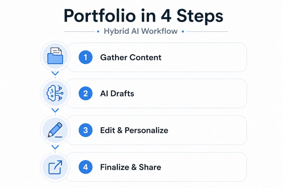
Step-by-step: Building your AI-powered portfolio
Now that you've chosen a tool, let's dig into the concrete steps to bring your portfolio to life. The process is more iterative than linear, but having a clear sequence prevents you from getting stuck or circling back unnecessarily.
- Start from a role-specific template, not a blank canvas. AI tools generate better output when they have context. Select the template closest to your field and intended audience. A developer template prompts different default sections than a creative or marketing layout.
- Input your master resume content. Paste your full experience, not a trimmed version. The AI needs range to make good suggestions. You'll trim afterward.
- Let the AI generate a first draft. Don't edit during generation. Read the full output first before touching anything.
- Audit the content critically. Flag any sentence that is vague, exaggerated, or doesn't sound like you. These are your priority edits.
- Add quantified results to every project. Replace "managed social media accounts" with "grew Instagram engagement by 62% in three months." Specific numbers make everything more credible.
- Select visuals deliberately. Every image should be purposeful. Screenshots of actual work, annotated diagrams, or before/after comparisons beat generic mockup images.
- Customize the summary section from scratch. This is the highest-stakes section. Don't let AI own it. Write it yourself, in your voice, with your specific angle on what you offer.
- Test on mobile before sharing. Over half of recruiters review portfolios on their phones. If your layout breaks or your text becomes unreadable on a small screen, you've already lost attention.
The Reddit UXDesign community has had extensive discussions about AI portfolios, and one pattern is consistent: using AI for copy refinement and structural suggestions is broadly accepted, but letting it drive UI and layout often produces work that feels templated and doesn't show your thinking process. Portfolios that demonstrate decision-making and learning, not just deliverables, consistently perform better in design and product roles.
You can explore customization options that let you personalize color palettes, typography, and section arrangements so the final product reflects your actual aesthetic judgment, not just a default setting.
For a deeper look at building a portfolio that communicates real business value, stepwise portfolio advice covers structural approaches that help your work speak directly to what employers care about.
Pro Tip: Review every impact statement in your portfolio. If it describes a task ("designed the landing page"), replace it with an outcome ("designed a landing page that increased trial signups by 28%"). Show the thinking behind the decision and the result it created.
Review, personalize, and stand out: Finalizing for impact
With your draft ready, make sure it's not just good but truly yours and effective. This is the stage where most people rush, and where the biggest differentiation happens. Two people can use the same AI tool, enter similar work histories, and produce portfolios that feel completely different based on how carefully they personalize the final output.
Use this checklist before sharing your portfolio with anyone:
- Clarity: Can a stranger understand what you do and what makes you good at it within 10 seconds of arriving on your page?
- Authenticity: Does every sentence sound like something you would actually say? Remove corporate language that doesn't match your voice.
- Quantification: Is every major claim backed by a number, timeframe, or concrete result?
- Visual consistency: Are your fonts, colors, and spacing consistent across all sections, or do some sections feel like they belong to a different page?
- Call to action: Is it obvious what you want the viewer to do next? Contact you, view your resume, book a call?
- Mobile view: Have you checked it on at least two different devices?
Here's a practical overview of the most common mistakes and what to do instead:
| Common mistake | Smart fix |
|---|---|
| Generic summary that could belong to anyone | Write a 2-3 sentence summary that includes your specific specialty, industry context, and one standout achievement |
| No metrics on project results | Add at least one number per featured project, even rough estimates backed by context |
| Inconsistent visual design | Use a two-color palette and one font family throughout. Less variety signals more control |
| Listing responsibilities, not outcomes | Reframe every bullet from what you did to what happened because of what you did |
| Overcrowded layout | Cut the weakest project. Three strong examples beat six mediocre ones every time |
"Full automation risks a bland, average outcome. Add your voice, your visual choices, and your specific reasoning to every section that matters. That's what separates a portfolio that gets shortlisted from one that gets skipped." Based on contrasting views from designers who tested AI tools extensively, the balance between automation and personal effort is the defining factor in portfolio performance.
The sections that matter most for personalization are your summary, your project detail descriptions, and your call-to-action. These three areas carry the highest weight in a recruiter's or client's mental evaluation. The project gallery and skills list provide supporting evidence, but the summary and project narratives do the persuasion work.
Use sharing options to distribute your portfolio through a clean, trackable link so you know when it's being viewed and can follow up at the right moment.
Why automation is a starting point—not the end—for real standout portfolios
Let's zoom out for a candid perspective on what really lands job offers or gets overlooked. The rush toward full AI automation in portfolio creation is understandable. The tools are genuinely fast, and the outputs look professional at first glance. But there's a real risk hiding underneath that polish.
When everyone uses the same AI generator with similar prompts and similar project histories, the outputs start to converge. The sentence structures sound alike. The project descriptions hit the same beats. The layouts follow the same visual logic. Recruiters who review hundreds of applications develop pattern recognition for this, and a portfolio that feels generated rather than crafted sends a subtle but powerful signal: this person didn't invest in their own presentation.
The hybrid approach is not just a compromise. It's the superior strategy. Use AI to generate the structure, suggest formatting, and produce a first pass at copy. Then spend real time on the parts that only you can write, your summary, your project narratives, your explanations of why you made specific decisions and what you learned when things didn't go as planned. That layer of reflection is what reads as genuine.
Our experience at Prezumi tells us clearly: one-page, quantification-driven profiles consistently outperform longer, more elaborate alternatives in terms of recruiter response rates. Not because they require less effort, but because the constraint forces clarity. Every word has to earn its place, and that discipline shows.
The advice to avoid sameness is concrete: add one thing to your portfolio that could only be there because of your specific experience. A project no one else worked on. A metric that reflects a real outcome you drove. A design choice you can explain with a reason. That one specific, irreplaceable detail changes the entire feel of a profile from templated to considered.
Explore balancing speed and uniqueness with templates that offer enough structure to move fast but enough flexibility to let your actual judgment show through.
Quickly launch a polished, personalized portfolio with Prezumi
Ready to put these insights into action? Here's where you can fast-track your next-step portfolio.
Prezumi is built exactly for this workflow. It gives you the AI-driven speed to get a polished draft live in minutes while keeping you in control of every section that matters for authenticity and impact.
Start with the Matrix portfolio template for a bold, modern layout that works especially well for tech and creative roles, or try the Minimal resume template if you want a clean, fast-loading profile that puts your content front and center. The AI portfolio editor helps you refine copy, reframe achievements, and personalize every section without starting from scratch. Whether you're a student building your first portfolio or a professional refreshing your presence before a job search, Prezumi gets you from blank page to shareable link in under five minutes.
Frequently asked questions
Are AI-generated portfolios accepted by employers and recruiters?
AI portfolios are broadly accepted when you've reviewed and personalized them to reflect your real work and voice. Recruiters respond to genuine outcomes and clear storytelling, not the tool behind the presentation.
How long does it take to build a portfolio with AI tools?
Based on testing across eight AI tools, you can produce a strong draft in under 30 minutes and finalize with a thorough review within an hour, assuming you have your materials ready before you start.
What's the best way to make sure my portfolio isn't generic?
Edit every AI-generated section to include your specific quantified results, your reasoning behind key decisions, and visual or stylistic choices that reflect your actual aesthetic. One unique, irreplaceable detail changes everything.
Should I use a one-page or multi-page portfolio?
One-page portfolios convert better and get more complete views, making them the stronger default for job applications. Multi-page formats make sense only when you have a large, varied body of work that genuinely requires more space to represent fairly.